top of page

Click me to play*

BBC iPlayer Heuristic Evaluation
Design Brief
Conduct an effective heuristic evaluation of the BBC iPlayer digital product – The idea was chosen to evaluate the usability of the product and measure how it adheres to a set of usability heuristics.
Project Duration
1 Week
Project Type
Academic Project
My Role
UI Designer
Tools
Figma
Current App Store Ratings
3
5
The iPlayer mobile app fairs quite low to average on ratings within the App store due to technical glitches and uneasy navigation through
The Areas In Question

Password Confirmation Screen

Search Results Screen

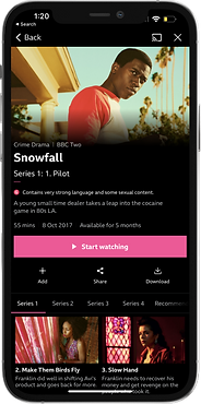
Show/Content Screen

Homepage Screen
This evaluation will bring forward issues users have found whiles using the Iplayer app. The screens shown above have been listed as causing the most problems with the least pleasurable user experience.
Video Streaming Screen
Understanding the Issue

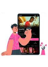
Meet Julian
GOALS
- Easily download shows to watch when travelling
- Searching for current and new shows i am interested in.
FRUSTRATIONS
- No easy access to downloading content.
- No options or results found when searching for specific programs or content.
''As much content as the iPlayer has, I do struggle to find what I am looking for when I search on the app.''
Interpretation through a Scenario

On his way to the airport for a 6 hour journey
Julian's Journey
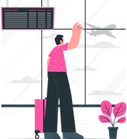
Decides to watch a show on the flight whiles waiting to board
Goes on iplayer app and tries to download the entire show & series
Identifying The Issues
Current Problem

User cannot confirm their password with two step verification/confirmation.
Password Confirmation Screen
Proposed Design Solution


Curvature of buttons to make it more sleek, more welcoming & less rigid.
Button CTA was also changed from blue to black, to prevent confusion of CTA as blue button was used for other actions within the app.
Add additional ‘confirm password section’
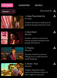
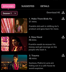
Search Result Screen
Current Problem
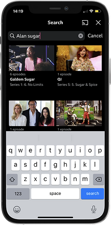
Keypad visible when search is completed with unrelated search results
Proposed Design Solution
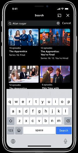
Relevant results listed + keypad collapses after tapping search
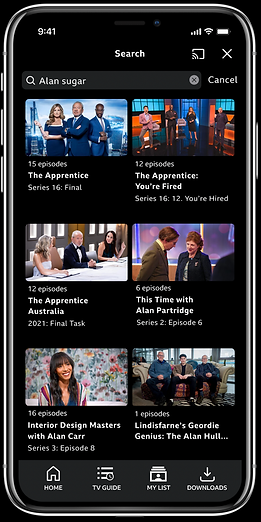
Curvature of cards to make it more sleek, more welcoming & less rigid.
There was a menu bar introduced to the bottom of the screen for easier navigation through the app.
Program/Content Screen
Current Problem
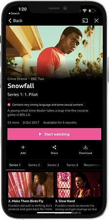

The content cannot be downloaded as a series collection, must be done per episode.
Proposed Design Solution
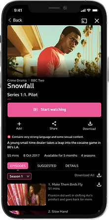
Curves have been introduced to all edges of cards, CTA's & icons to give a friendly, sleek & clean look. Description of episodes have also been moved to the right of the image to allow more content to be shown.
Download option available and visible beside each episode/card
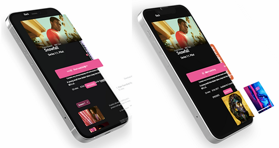
Exploded Axonometric showing proposed solution including cards, descriptions and CTA's
Video showing content suggestions based on watch or searched programs excepts.

Click me to play*
Homepage Screen
Current Problem


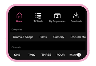
The download option is not available on the homepage whiles there is no menu bar at bottom of screen, rather it is placed in the top right corner of the screen
Proposed Design Solution


Menu bar was added to the bottom of the screen with a quick link to downloads. Channels were taken out of the drop down menu and placed on home screen for easy access. Cards, icons & CTA's have edges curved to give a sleek look to the design
Proposed Design Solution

Click me to play*

Walk through the new homepage content and structure.
Video Streaming Screen
Current Problem
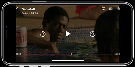
The inability to restart the selected programme from the beginning within recently viewed items
Proposed Design Solution


Addition of a restart button on the screen before playing
THe Bigger picture
The long term goal is to allow users using the app on the television, ipad or mobile a more seamless & user friendly experience. I believe with the design changes made, it will be a stepping stone to a better user journey within the Iplayer.
Thank you for viewing!
bottom of page